Maxwell (max) Ettel

(formal);

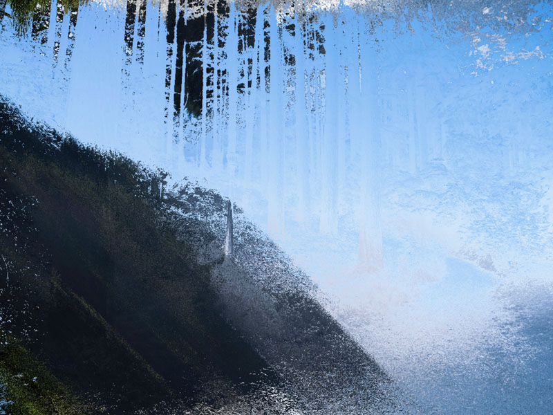
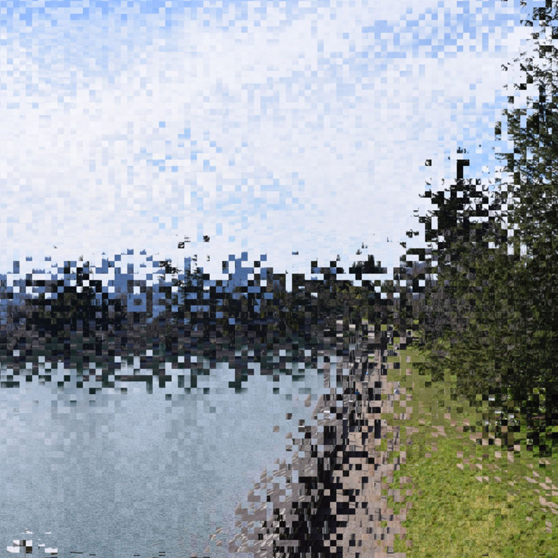
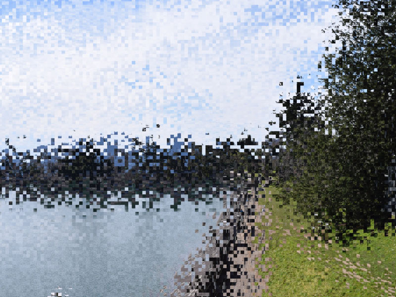
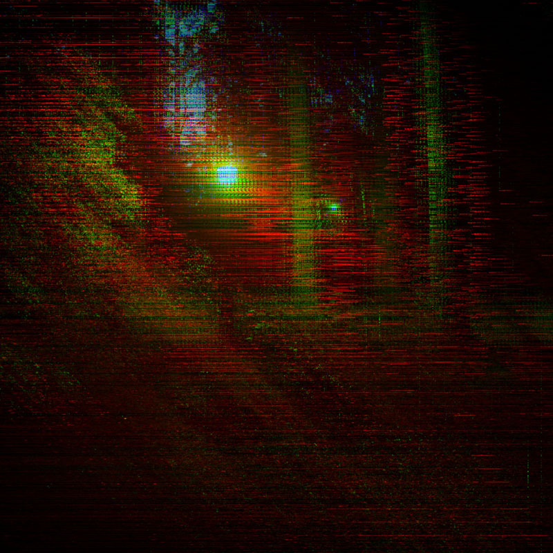
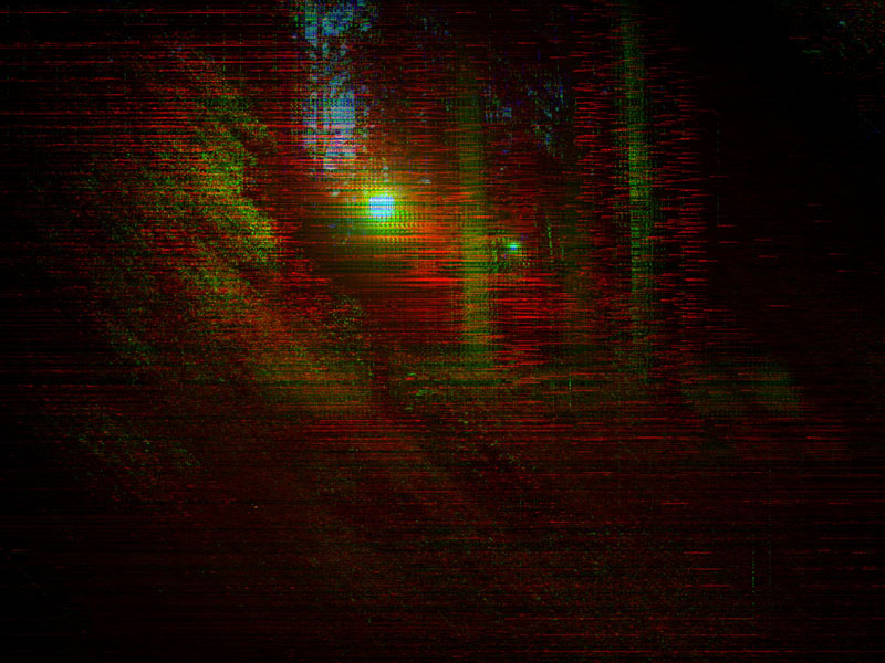
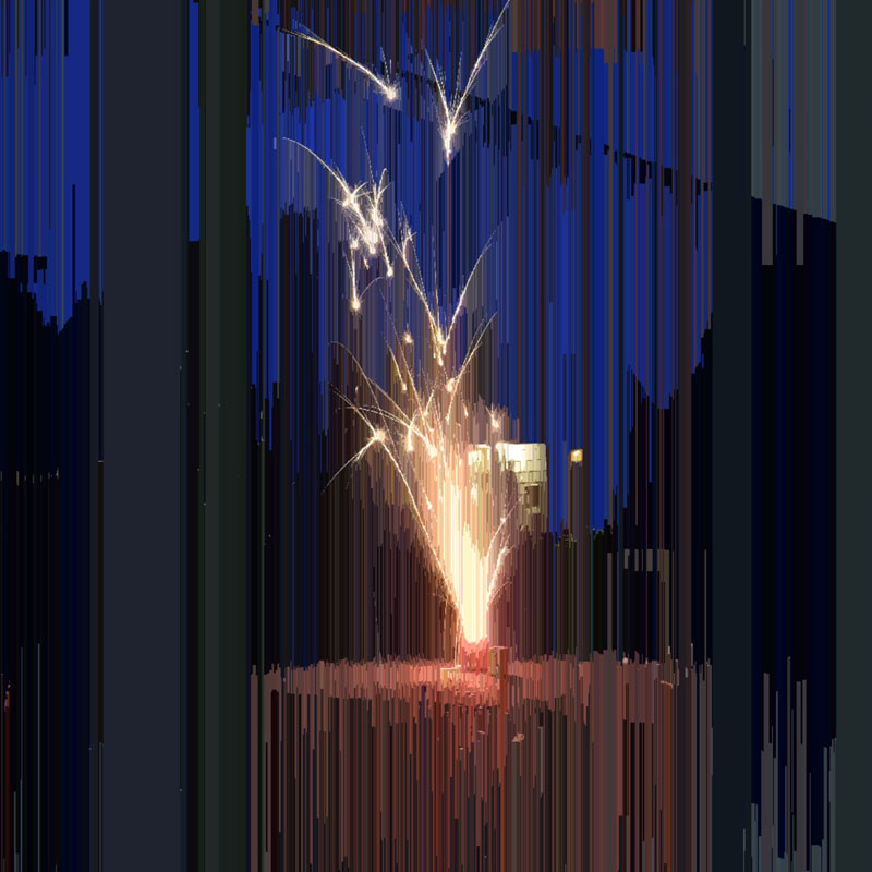
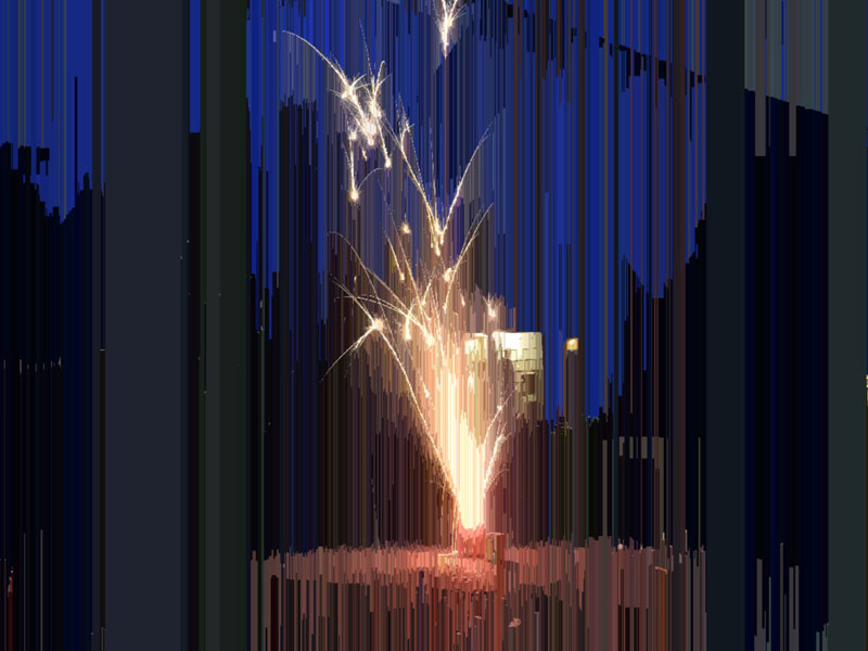
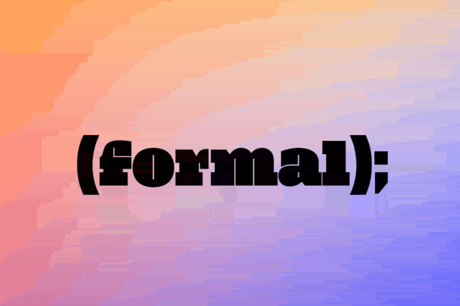
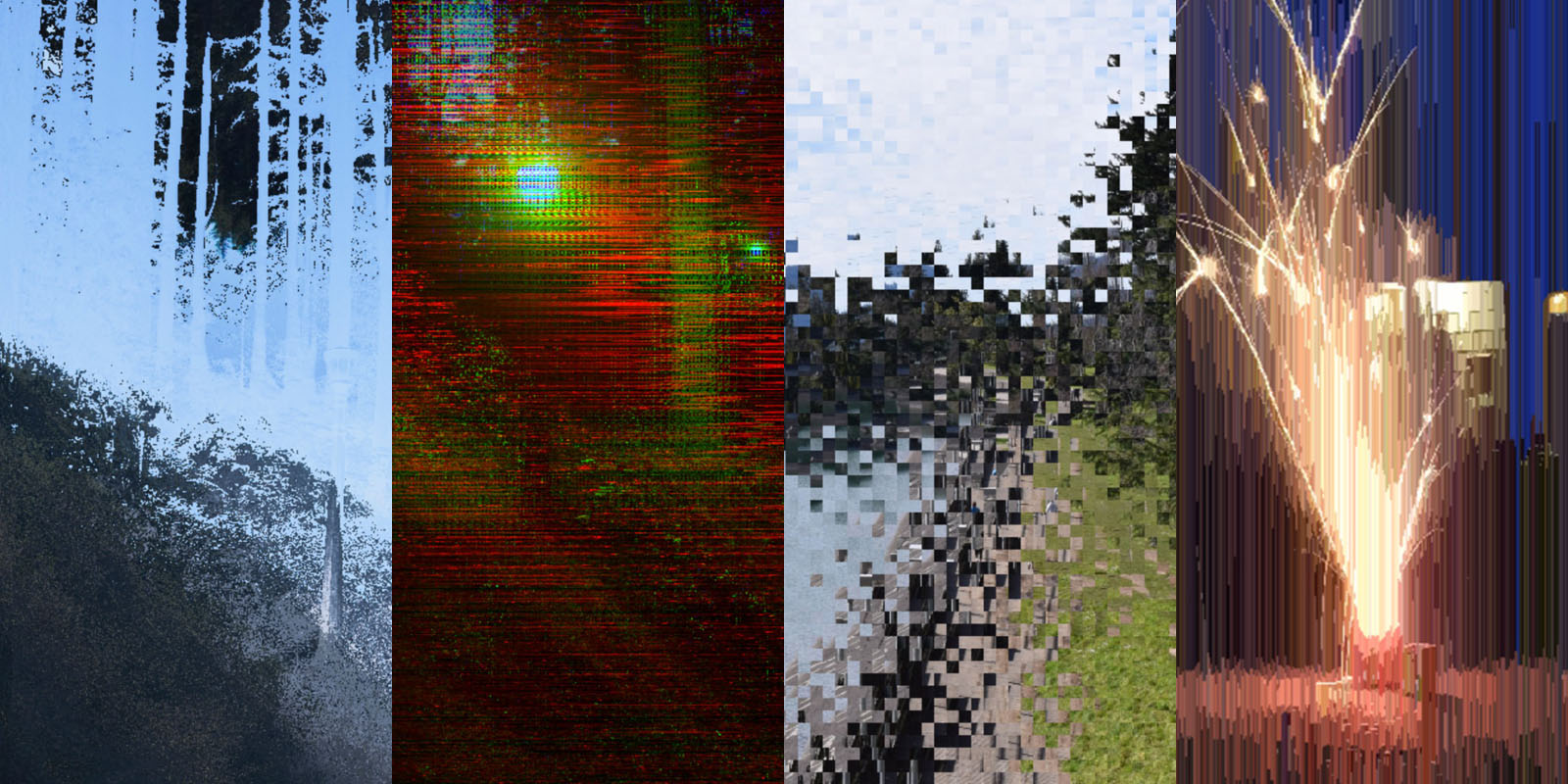
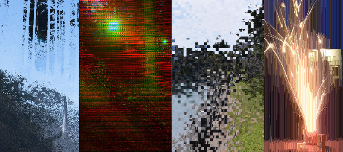
formal is the final product of my thesis project for the Portland State University Honors College. The primary product of this project was image processing code, designed with the concepts and theories developed from research I conducted. The code was written in p5js. A javascript library built to work like Processing. In this project I created 4 different scripts, that each created different visual effects. They are: distortion, cellshift, aberration, and pseudo-compression.

Distortion

How can I modify one image with another. This code displaces pixel positions based off of the brightness values of the corresponding pixel in a separate image.

Cell Shift

How can I create an intermediary between global modifications and pixel level modifications. This code takes an image and processes it in cells, which acts as modification at an intermediate level between the global and pixel.

Aberration

What began as an exploration in replicating chromatic aberration resulted in a result that emulates digital artifacts. This code took the basic means of replicating chromatic aberration, and extrapolated from it. As opposed to global shifting of color channels, this code uses trigonometric functions to adjust color channel shifting on a pixel level.

Pseudo Compression

Taking the basis of image compression and twisting it. This code is built to compress at the very basis of the concept. Colors are heavily overwritten with each other, which results in blocks of color that distort the final image.

The Site

The final product of this project is a website to house the code. It features background on the ideas, as well as demos of the code with preset images.

Design Focus

The overall idea with the design of the site was to act as a platform for the imagery. This meant that the visual elements would need to not add to the chaos of the glitched imagery. However, I also wanted to create a style that takes a new approach to the visual language of "glitch".

Visual Language

The conventional visual language for 'glitch' usually focuses on the base level visual elements. These are usually presented as processed images, misgnaligned visual elements, and chromatic aberrations. My approach was to instead look at the thematic concepts around 'glitch', and find an analog. This approach resulted in the use of simplistic formal elements, paired with some unique superceding component. This superceding component became the header typeface used in the site, neplus. I found it's forms to have an ordered, yet mildly chaotic element that meshed well with the thematic elements that I was exploring. Coupled with this instead of solid lines in composition, dotted lines were employed. They act as a representation of the ordered grid of an image, as well as providing some visual interest in certain portions of the site.